epidist is a toolkit for flexibly estimating epidemiological delays built on top of brms (Bayesian Regression Models using Stan).
brms provides a powerful framework for Bayesian modelling with an accessible R interface to Stan.
By building on brms, epidist inherits the ability to work within the broader brms ecosystem, allowing users to leverage existing tools for model diagnostics, posterior predictive checks, and model comparison while addressing the specific challenges of delay distribution estimation.
See the vignette("faq") for more details on the tools available in the brms ecosystem.
In this vignettte, we will give a quick start guide to using the epidist package.
To get started we will introduce some of the key concepts in delay distribution estimation, and then simulate some data delay data from a stochastic outbreak that includes common biases.
Using this simulated data we will then show how to use the epidist package to estimate a distribution using a simple model and a model that accounts for some of the common issues in delay distribution estimation.
We will then compare the output of these models to the true delay distribution used to simulate the data again using epidst tools.
1 Key concepts in delay distribution estimation
In epidemiology, we often need to understand the time between key events - what we call “delays”. Think about things like:
- incubation period (how long between getting infected and showing symptoms),
- serial interval (time between when one person shows symptoms and when someone they infected shows symptoms), and
- generation interval (time between when one person gets infected and when they infect someone else).
We can think of all these as the time between a “primary event” and a “secondary event”.
The tricky bit? Getting accurate estimates of these delays from real-world data is a challenge. The two main challenges we typically face are:
- interval censoring (we often only know events happened within a time window, not the exact time), and
- right truncation (we might miss observing later events if our observation period ends).
Don’t worry if these terms sound a bit technical! In Section 3, we’ll walk through what these issues look like by simulating the kind of data you might see during an outbreak.
Then in Section 5, we’ll show how epidist helps you estimate delay distributions accurately by accounting for these issues.
For those interested in the technical details, epidist implements models following best practices in the field.
Check out Park et al. (2024) for a methodological overview and Charniga et al. (2024) for a practical checklist designed for applied users.
We also recommend the nowcasting and forecasting infectious disease dynamics course for more hands on learning.
2 Setup
To run this vignette yourself, as well as the epidist package, you will need the following packages:
library(epidist)
library(ggplot2)
library(dplyr)
#>
#> Attaching package: 'dplyr'
#> The following objects are masked from 'package:stats':
#>
#>     filter, lag
#> The following objects are masked from 'package:base':
#>
#>     intersect, setdiff, setequal, union
library(tidyr)
library(purrr) # nolint
library(tibble)
3 Simulating data
We simulate data from an outbreak setting where the primary event is symptom onset and the secondary event is case notification.
We assume that both events are dates and so we do not know precise event times.
This is typically the most common setting for delay distribution estimation.
This is a simplified version of the more complete setting that epidist supports where events can have different censoring intervals.
We also assume that we are observing a sample of cases during the outbreak.
This means that our data is both interval censored for each event and truncated for the secondary event.
We first assume that the reporting delay is lognormal with a mean log of 1.6 and a log standard deviation of 0.5.
Here we use the add_mean_sd() function to add the mean and sd to the data.frame.
secondary_dist <- data.frame(mu = 1.6, sigma = 0.5)
class(secondary_dist) <- c("lognormal_samples", class(secondary_dist))
secondary_dist <- add_mean_sd(secondary_dist)

secondary_dist
#>    mu sigma     mean       sd
#> 1 1.6   0.5 5.612521 2.991139
We the simulate the stochastic outbreak in continuous time, sample a reporting delay for each event and finally observe the events (i.e restrict them to be dates). We assume that the outbreak has a growth rate of 0.2 and that we observe the outbreak for 25 days.
growth_rate <- 0.2
obs_time <- 25
Click to expand for simulation details
First, we use the Gillepsie algorithm to generate infectious disease outbreak data (Figure 3.1) from a stochastic compartmental model.
outbreak <- simulate_gillespie(r = growth_rate, seed = 101)
outbreak |>
  filter(case %% 50 == 0) |>
  ggplot(aes(x = ptime, y = case)) +
  geom_point(col = "#56B4E9") +
  labs(x = "Primary event time (day)", y = "Case number") +
  theme_minimal()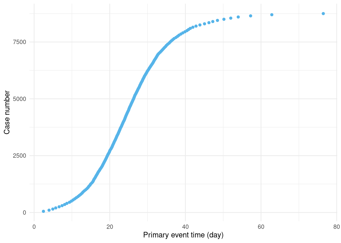
Figure 3.1: Early on in the epidemic, there is a high rate of growth in new cases. As more people are infected, the rate of growth slows. (Only every 50th case is shown to avoid over-plotting.)
outbreak is a data.frame with the two columns: case and ptime.
Here ptime is a numeric column giving the time of infection.
In reality, it is more common to receive primary event times as a date rather than a numeric.
head(outbreak)
#>   case      ptime
#> 1    1 0.04884052
#> 2    2 0.06583120
#> 3    3 0.21857827
#> 4    4 0.24963421
#> 5    5 0.30133392
#> 6    6 0.31425010
To generate secondary events, we will use a lognormal distribution (Figure 3.2) for the delay between primary and secondary events:
obs <- simulate_secondary(
  outbreak,
  dist = rlnorm,
  meanlog = secondary_dist[["mu"]],
  sdlog = secondary_dist[["sigma"]]
)
ggplot(data.frame(x = c(0, 30)), aes(x = x)) +
  geom_function(
    fun = dlnorm,
    args = list(
      meanlog = secondary_dist[["mu"]],
      sdlog = secondary_dist[["sigma"]]
    )
  ) +
  theme_minimal() +
  labs(
    x = "Delay between primary and secondary event (days)",
    y = "Probability density"
  )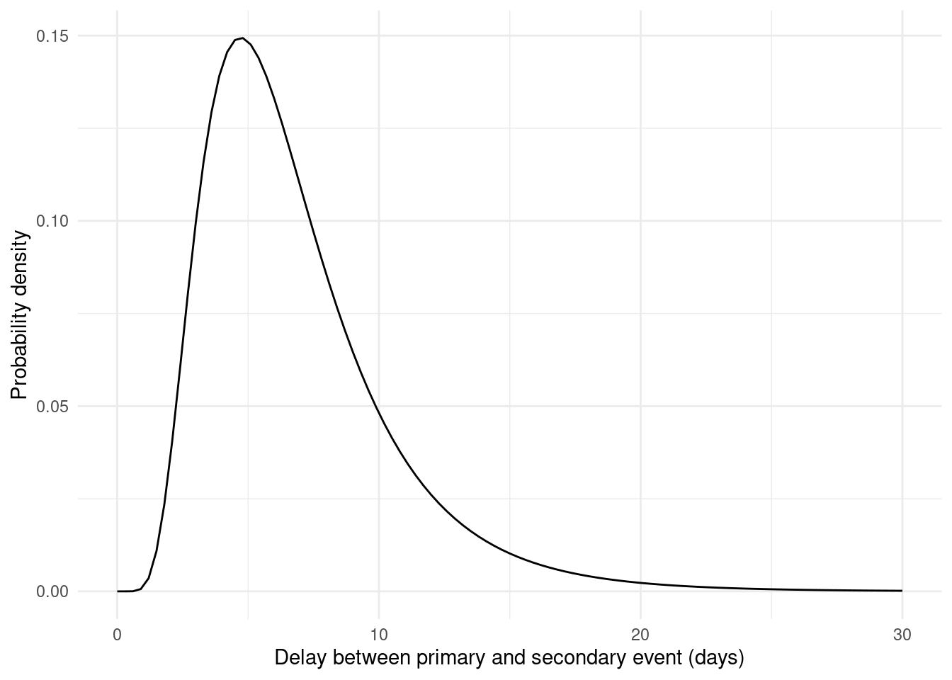
Figure 3.2: The lognormal distribution is skewed to the right. Long delay times still have some probability.
obs |>
  filter(case %% 50 == 0) |>
  ggplot(aes(y = case)) +
  geom_segment(
    aes(x = ptime, xend = stime, y = case, yend = case),
    col = "grey"
  ) +
  geom_point(aes(x = ptime), col = "#56B4E9") +
  geom_point(aes(x = stime), col = "#009E73") +
  labs(x = "Event time (day)", y = "Case number") +
  theme_minimal()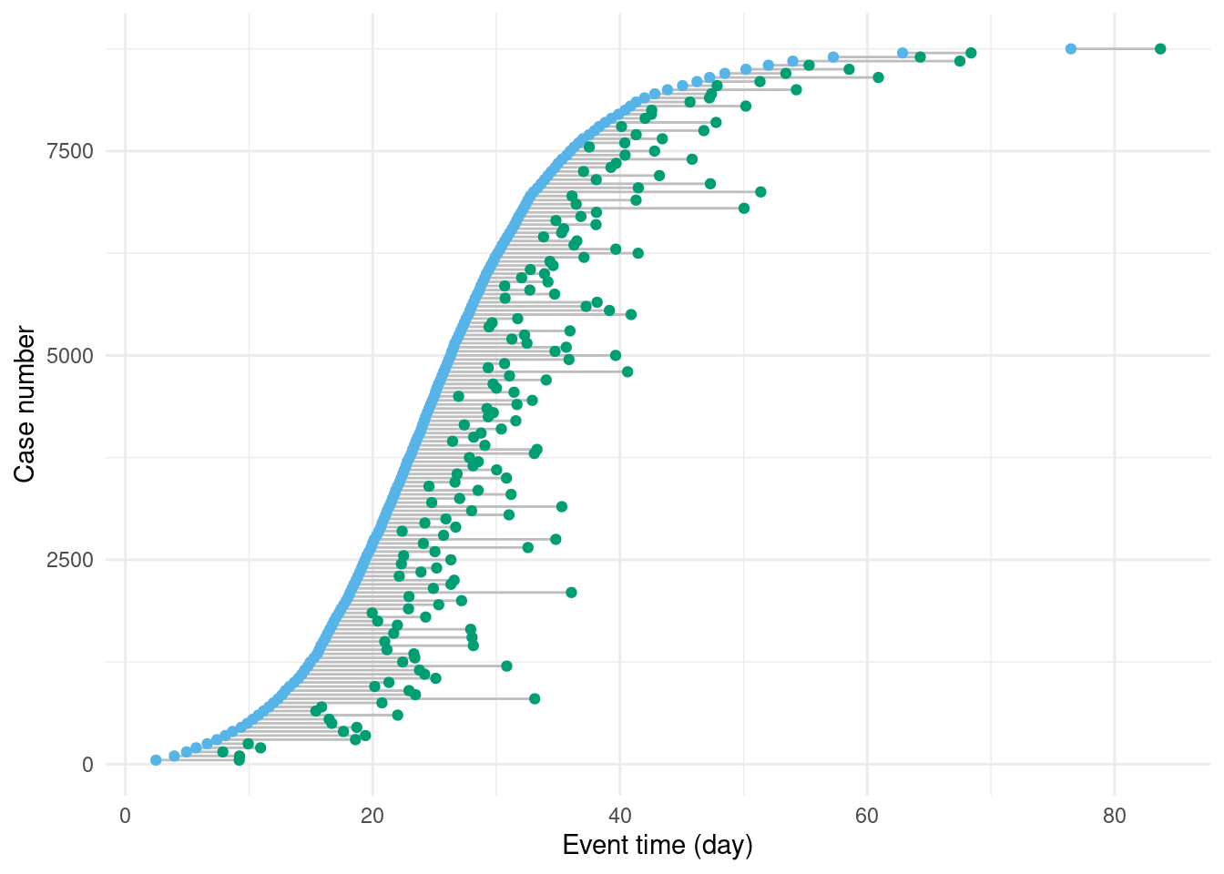
Figure 3.3: Secondary events (in green) occur with a delay drawn from the lognormal distribution (Figure 3.2).As with Figure 3.1, to make this figure easier to read, only every 50th case is shown.
obs is now a data.frame with further columns for delay and stime.
The secondary event time is simply the primary event time plus the delay:
all(obs$ptime + obs$delay == obs$stime)
#> [1] TRUE
If we were to receive the complete data obs as above then it would be simple to accurately estimate the delay distribution.
However, in reality, during an outbreak we almost never receive the data as above.
First, the times of primary and secondary events will usually be censored. This means that rather than exact event times, we observe event times within an interval. Here we suppose that the interval is daily, meaning that only the date of the primary or secondary event, not the exact event time, is reported (Figure 3.4):
obs_cens <- mutate(
  obs,
  ptime_lwr = floor(.data$ptime),
  ptime_upr = .data$ptime_lwr + 1,
  stime_lwr = floor(.data$stime),
  stime_upr = .data$stime_lwr + 1,
  delay_daily = stime_lwr - ptime_lwr
)
Click to expand for code to create the censored data figure
p_cens <- obs_cens |>
  filter(case %% 50 == 0, case <= 500) |>
  ggplot(aes(y = case)) +
  geom_segment(
    aes(x = ptime, xend = stime, y = case, yend = case),
    col = "grey"
  ) +
  # The primary event censoring intervals
  geom_errorbarh(
    aes(xmin = ptime_lwr, xmax = ptime_upr, y = case),
    col = "#56B4E9", height = 5
  ) +
  # The secondary event censoring intervals
  geom_errorbarh(
    aes(xmin = stime_lwr, xmax = stime_upr, y = case),
    col = "#009E73", height = 5
  ) +
  geom_point(aes(x = ptime), fill = "white", col = "#56B4E9", shape = 21) +
  geom_point(aes(x = stime), fill = "white", col = "#009E73", shape = 21) +
  labs(x = "Event time (day)", y = "Case number") +
  theme_minimal()
p_cens
#> `height` was translated to `width`.
#> `height` was translated to `width`.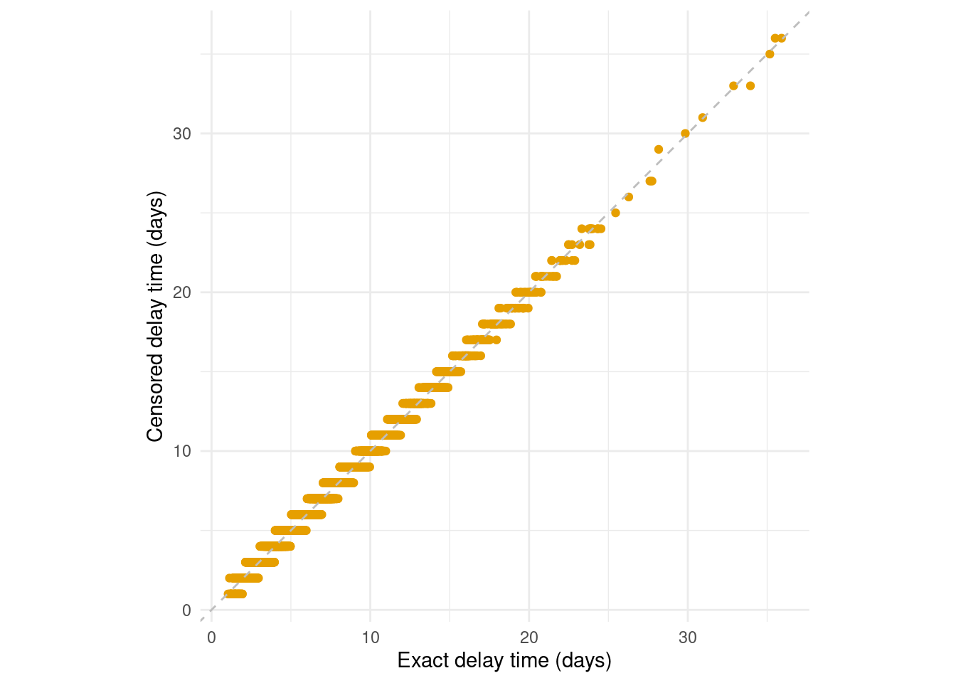
Figure 3.4: Interval censoring of the primary and secondary event times obscures the delay times. A common example of this is when events are reported as daily aggregates. While daily censoring is most common, epidist supports the primary and secondary events having other delay intervals.
During an outbreak we will usually be estimating delays in real time. The result is that only those cases with a secondary event occurring before some time will be observed. This is called (right) truncation, and biases the observation process towards shorter delays. In Figure 3.5 we see a simulation of this process where we have restricted the data to only include cases where the secondary event occurred before day 10.
Click to expand for code to create the truncated data figure
p_trunc <- obs_cens |>
  filter(case %% 50 == 0, case <= 500) |>
  mutate(
    observed = ifelse(stime_upr <= 10, "observed", "not observed"),
    observed = factor(observed, levels = c("observed", "not observed"))
  ) |>
  ggplot(aes(y = case)) +
  geom_segment(
    aes(x = ptime, xend = stime, y = case, yend = case, linetype = observed),
    col = "grey"
  ) +
  # The primary event censoring intervals
  geom_errorbarh(
    aes(xmin = ptime_lwr, xmax = ptime_upr, y = case),
    col = "#56B4E9", height = 5
  ) +
  # The secondary event censoring intervals
  geom_errorbarh(
    aes(xmin = stime_lwr, xmax = stime_upr, y = case),
    col = "#009E73", height = 5
  ) +
  geom_point(aes(x = ptime), fill = "white", col = "#56B4E9", shape = 21) +
  geom_point(aes(x = stime), fill = "white", col = "#009E73", shape = 21) +
  geom_vline(xintercept = 10, col = "black", linetype = "dashed") +
  labs(x = "Event time (day)", y = "Case number") +
  theme_minimal() +
  theme(legend.position = "none")
p_trunc
#> `height` was translated to `width`.
#> `height` was translated to `width`.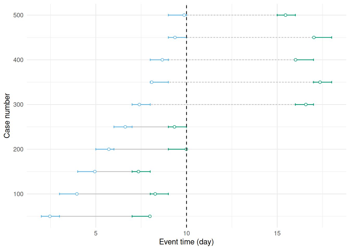
Figure 3.5: This figure duplicates Figure 3.4 but adds truncation at 10 days due to stopping the observation period at this point. Event pairs using dashed lines are now not observed.
We can simulate the effect of right truncation by restricting the data to only include cases where the secondary event occurred before the observation time.
obs_cens_trunc <- obs_cens |>
  mutate(obs_time = obs_time) |>
  filter(.data$stime_upr <= .data$obs_time)
Finally, in reality, it’s not possible to observe every case.
We suppose that a sample of individuals of size sample_size are observed:
sample_size <- 200This sample size corresponds to 7.7% of the data.
obs_cens_trunc_samp <- slice_sample(
  obs_cens_trunc,
  n = sample_size, replace = FALSE
)
Click to expand for code to create the observed data histogram
#Prepare the complete, retrospective data
complete_data <- obs_cens |>
  mutate(type = "Censored retrospective data") |>
  select(delay = delay_daily, type)

# Prepare the censored, truncated, sampled data
censored_data <- obs_cens_trunc_samp |>
  mutate(type = "Censored, truncated,\nsampled data") |>
  select(delay = delay_daily, type)

# Combine the datasets
combined_data <- bind_rows(complete_data, censored_data)

# Calculate proportions
plot_data <- combined_data |>
  group_by(type, delay, .drop = FALSE) |>
  summarise(n = n()) |>
  mutate(p = n / sum(n))
#> `summarise()` has grouped output by 'type'. You can override using the
#> `.groups` argument.

# Create the plot
delay_histogram <- ggplot(plot_data) +
  geom_col(
    aes(x = delay, y = p, fill = type, group = type),
    position = position_dodge2(preserve = "single")
  ) +
  scale_fill_brewer(palette = "Set2") +
  geom_function(
    data = data.frame(x = c(0, 30)), aes(x = x),
    fun = dlnorm,
    args = list(
      meanlog = secondary_dist[["mu"]],
      sdlog = secondary_dist[["sigma"]]
    ),
    linewidth = 1.5
  ) +
  labs(
    x = "Delay between primary and secondary event (days)",
    y = "Probability density",
    fill = ""
  ) +
  theme_minimal() +
  theme(legend.position = "bottom")
delay_histogram![The histogram of delays from the fully observed by double interval censored data obs_cens is slightly biased relative to the true distribution (black line). This bias is absolute (Park et al. 2024) and so will be more problematic for shorter delays. The data that was observed in real-time, obs_cens_trunc_samp, is more biased still due to right truncation. This bias is relative and so will be more problematic for longer delays or when more of the data is truncated. We always recommend [Charniga et al. (2024); Table 2] adjusting for censoring when it is present and considering if the data is also meaningfully right truncated.](figures/epidist-obs-est-1.png)
Figure 3.6: The histogram of delays from the fully observed by double interval censored data obs_cens is slightly biased relative to the true distribution (black line). This bias is absolute (Park et al. 2024) and so will be more problematic for shorter delays. The data that was observed in real-time, obs_cens_trunc_samp, is more biased still due to right truncation. This bias is relative and so will be more problematic for longer delays or when more of the data is truncated. We always recommend [Charniga et al. (2024); Table 2] adjusting for censoring when it is present and considering if the data is also meaningfully right truncated.
Issues not considered
Another issue, which epidist currently does not account for, is that sometimes only the secondary event might be observed, and not the primary event.
For example, symptom onset may be reported, but start of infection unknown.
Discarding events of this type leads to what are called ascertainment biases.
Whereas each case is equally likely to appear in the sample above, under ascertainment bias some cases are more likely to appear in the data than others.
Our data is now very nearly what we would observe in practice but as a final step we will transform it to use meaningful dates.
To do this we introduce a outbreak_start_date which is the date of the first infection.
outbreak_start_date <- as.Date("2024-02-01")

obs_data <- obs_cens_trunc_samp |>
  select(case, ptime_lwr, ptime_upr, stime_lwr, stime_upr, obs_time) |>
  transmute(
    id = case,
    symptom_onset = outbreak_start_date + ptime_lwr,
    case_notification = outbreak_start_date + stime_lwr,
    obs_date = outbreak_start_date + obs_time
  )
The resulting simulated data obs_data has 4 columns: id, symptom_onset, case_notification, and obs_time.
Where symptom_onset and case_notification are dates and obs_date is the date of the last observation based on case notification.
head(obs_data)
#>     id symptom_onset case_notification   obs_date
#> 1 1280    2024-02-16        2024-02-24 2024-02-26
#> 2 2167    2024-02-19        2024-02-25 2024-02-26
#> 3  743    2024-02-12        2024-02-14 2024-02-26
#> 4 2257    2024-02-19        2024-02-22 2024-02-26
#> 5 1820    2024-02-18        2024-02-20 2024-02-26
#> 6 1107    2024-02-15        2024-02-19 2024-02-26
4 Preprocessing the data
The first step in using epidist is to convert the data into a format that epidist understands.
The most common format is a linelist, which is a table with one row per case and columns for the primary and secondary event dates.
The as_epidist_linelist_data() function converts the data into a linelist format.
It has a few different entry points depending on the format of the data you have but the most common is to use a data.frame containing dates.
This dispatches to as_epidist_linelist_data.data.frame() which takes the column names of the primary and secondary event dates and the observation date.
linelist_data <- as_epidist_linelist_data(
  obs_data,
  pdate_lwr = "symptom_onset",
  sdate_lwr = "case_notification",
  obs_date = "obs_date"
)
#> ℹ No primary event upper bound provided, using the primary event lower bound + 1 day as the assumed upper bound.
#> ℹ No secondary event upper bound provided, using the secondary event lower bound + 1 day as the assumed upper bound.

head(linelist_data)
#> # A tibble: 6 × 11
#>   ptime_lwr ptime_upr stime_lwr stime_upr obs_time    id pdate_lwr  sdate_lwr
#>       <dbl>     <dbl>     <dbl>     <dbl>    <dbl> <int> <date>     <date>
#> 1        15        16        23        24       25  1280 2024-02-16 2024-02-24
#> 2        18        19        24        25       25  2167 2024-02-19 2024-02-25
#> 3        11        12        13        14       25   743 2024-02-12 2024-02-14
#> 4        18        19        21        22       25  2257 2024-02-19 2024-02-22
#> 5        17        18        19        20       25  1820 2024-02-18 2024-02-20
#> 6        14        15        18        19       25  1107 2024-02-15 2024-02-19
#> # ℹ 3 more variables: obs_date <date>, pdate_upr <date>, sdate_upr <date>
Here you can see that epidist has assumed that the events are both daily censored as upper bounds have not been provided.
If your data was not daily censored, you can provide the upper bounds (pdate_upr and sdate_upr) to as_epidist_linelist_data() and it will use the correct model.
Internally this function converts the data into a relative (to the first event date) time format and creates a variable (delay) which contains the observed delay.
These are the variables that epidist will use to fit the model.
Other formats are supported, for example aggregate data (e.g. daily case counts), and there is functionality to map between these formats.
See ?as_epidist_aggregate_data() for more details.
5 Fitting models
Now we are ready to fit some epidist models.
epidist provides a range of models for different settings.
All epidist models have a as_epidist_<model>_model() function that can be used to convert the data into a format that the model can use.
5.1 Fit a model that doesn’t account for censoring and truncation
We will start with the simplest model, which does not account for censoring or truncation.
Behind the scenes this model is essentially just a wrapper around the brms package.
To use this model we need to use the as_epidist_naive_model() function.
naive_data <- as_epidist_naive_model(linelist_data)
naive_data
#> # A tibble: 200 × 13
#>    ptime_lwr ptime_upr stime_lwr stime_upr obs_time    id pdate_lwr  sdate_lwr
#>        <dbl>     <dbl>     <dbl>     <dbl>    <dbl> <int> <date>     <date>
#>  1        15        16        23        24       25  1280 2024-02-16 2024-02-24
#>  2        18        19        24        25       25  2167 2024-02-19 2024-02-25
#>  3        11        12        13        14       25   743 2024-02-12 2024-02-14
#>  4        18        19        21        22       25  2257 2024-02-19 2024-02-22
#>  5        17        18        19        20       25  1820 2024-02-18 2024-02-20
#>  6        14        15        18        19       25  1107 2024-02-15 2024-02-19
#>  7        10        11        16        17       25   535 2024-02-11 2024-02-17
#>  8        10        11        11        12       25   583 2024-02-11 2024-02-12
#>  9         7         8        12        13       25   286 2024-02-08 2024-02-13
#> 10        16        17        22        23       25  1616 2024-02-17 2024-02-23
#> # ℹ 190 more rows
#> # ℹ 5 more variables: obs_date <date>, pdate_upr <date>, sdate_upr <date>,
#> #   delay <dbl>, n <dbl>
and now we fit the model using the the No-U-Turn Sampler (NUTS) Markov chain Monte Carlo (MCMC) algorithm via the brms R package (Bürkner 2017).
naive_fit <- epidist(
  naive_data,
  chains = 4, cores = 2, refresh = ifelse(interactive(), 250, 0)
)
#> ℹ Data summarised by unique combinations of:
#> * Model variables: delay bounds, observation time, and primary censoring window
#> ! Reduced from 200 to 12 rows.
#> ℹ This should improve model efficiency with no loss of information.
#> Compiling Stan program...
#>
#> Trying to compile a simple C file
#> Running /opt/R/4.5.2/lib/R/bin/R CMD SHLIB foo.c
#> using C compiler: ‘gcc (Ubuntu 13.3.0-6ubuntu2~24.04) 13.3.0’
#> gcc -std=gnu2x -I"/opt/R/4.5.2/lib/R/include" -DNDEBUG   -I"/home/runner/work/_temp/Library/Rcpp/include/"  -I"/home/runner/work/_temp/Library/RcppEigen/include/"  -I"/home/runner/work/_temp/Library/RcppEigen/include/unsupported"  -I"/home/runner/work/_temp/Library/BH/include" -I"/home/runner/work/_temp/Library/StanHeaders/include/src/"  -I"/home/runner/work/_temp/Library/StanHeaders/include/"  -I"/home/runner/work/_temp/Library/RcppParallel/include/"  -I"/home/runner/work/_temp/Library/rstan/include" -DEIGEN_NO_DEBUG  -DBOOST_DISABLE_ASSERTS  -DBOOST_PENDING_INTEGER_LOG2_HPP  -DSTAN_THREADS  -DUSE_STANC3 -DSTRICT_R_HEADERS  -DBOOST_PHOENIX_NO_VARIADIC_EXPRESSION  -D_HAS_AUTO_PTR_ETC=0  -include '/home/runner/work/_temp/Library/StanHeaders/include/stan/math/prim/fun/Eigen.hpp'  -D_REENTRANT -DRCPP_PARALLEL_USE_TBB=1   -I/usr/local/include    -fpic  -g -O2  -c foo.c -o foo.o
#> In file included from /home/runner/work/_temp/Library/RcppEigen/include/Eigen/Core:19,
#>                  from /home/runner/work/_temp/Library/RcppEigen/include/Eigen/Dense:1,
#>                  from /home/runner/work/_temp/Library/StanHeaders/include/stan/math/prim/fun/Eigen.hpp:22,
#>                  from <command-line>:
#> /home/runner/work/_temp/Library/RcppEigen/include/Eigen/src/Core/util/Macros.h:679:10: fatal error: cmath: No such file or directory
#>   679 | #include <cmath>
#>       |          ^~~~~~~
#> compilation terminated.
#> make: *** [/opt/R/4.5.2/lib/R/etc/Makeconf:202: foo.o] Error 1
#> Start sampling
Note that here we use the default rstan backend but we generally recommend using the cmdstanr backend for faster sampling and additional features.
This can be set using backend = "cmdstanr" after following the installing CmdStan instructions in the README.
One of the progress messages output here is “Reduced from 200 to 91 rows”.
What this is indicating is that non-unique rows (based on the user formula) have been aggregated.
This is done in several of the epidist models for efficiency and should have no impact on accuracy.
If you want to explore this see the documentation for the epidist_transform_data_model().
The naive_fit object is a brmsfit object containing MCMC samples from each of the parameters in the model, shown in the table below.
Users familiar with Stan and brms, can work with fit directly.
Any tool that supports brms fitted model objects will be compatible with fit.
For example, we can use the built in summary() function to summarise the posterior distribution of the parameters.
summary(naive_fit)
#>  Family: lognormal
#>   Links: mu = identity; sigma = log
#> Formula: delay | weights(n) ~ 1
#>          sigma ~ 1
#>    Data: transformed_data (Number of observations: 12)
#>   Draws: 4 chains, each with iter = 2000; warmup = 1000; thin = 1;
#>          total post-warmup draws = 4000
#>
#> Regression Coefficients:
#>                 Estimate Est.Error l-95% CI u-95% CI Rhat Bulk_ESS Tail_ESS
#> Intercept           1.42      0.03     1.35     1.48 1.00     3603     2810
#> sigma_Intercept    -0.75      0.05    -0.85    -0.66 1.00     3158     2569
#>
#> Draws were sampled using sampling(NUTS). For each parameter, Bulk_ESS
#> and Tail_ESS are effective sample size measures, and Rhat is the potential
#> scale reduction factor on split chains (at convergence, Rhat = 1).
Here we see some information about our model including the links used for each parameter, the formula used (this contains the formula you specified as well some additions we add for each model), summaries of the data, the posterior samples, and the regression coefficients, and some fitting diagnostics.
As we used a simple model with only an intercept (see vignettes("ebola") for some complex options) the Intercept term corresponds to the mean log of the lognormal and the sigma_Intercept term corresponds to the log (due to the log link) of the log standard deviation of the lognormal.
Remember that we simulated the data with a meanlog of 1.6 and a log standard deviation of 0.5. We see that we have recovered neither of these parameters well (applying the log to the log standard deviation means our target value is ~-0.69) and that means that the resulting distribution we have estimated will not reflect the data well. If we were going to use this estimate in additional analyses it could lead to biases and flawed decisions.
5.2 Fit a model that accounts for biases and truncation
epidist provides a range of models that can account for biases in observed data.
In most cases, we recommend using the marginal model.
This model accounts for interval censoring of the primary and secondary events and right truncation of the secondary event.
Behind the scenes it uses a likelihood from the primarycensored R package.
This package contains exact numerical and analytical solutions for numerous double censored and truncated distributions in both Stan and R.
The documentation for primarycensored is a good place for learning more about this.
marginal_data <- as_epidist_marginal_model(linelist_data)
marginal_data
#> # A tibble: 200 × 18
#>    ptime_lwr ptime_upr stime_lwr stime_upr obs_time    id pdate_lwr  sdate_lwr
#>        <dbl>     <dbl>     <dbl>     <dbl>    <dbl> <int> <date>     <date>
#>  1        15        16        23        24       25  1280 2024-02-16 2024-02-24
#>  2        18        19        24        25       25  2167 2024-02-19 2024-02-25
#>  3        11        12        13        14       25   743 2024-02-12 2024-02-14
#>  4        18        19        21        22       25  2257 2024-02-19 2024-02-22
#>  5        17        18        19        20       25  1820 2024-02-18 2024-02-20
#>  6        14        15        18        19       25  1107 2024-02-15 2024-02-19
#>  7        10        11        16        17       25   535 2024-02-11 2024-02-17
#>  8        10        11        11        12       25   583 2024-02-11 2024-02-12
#>  9         7         8        12        13       25   286 2024-02-08 2024-02-13
#> 10        16        17        22        23       25  1616 2024-02-17 2024-02-23
#> # ℹ 190 more rows
#> # ℹ 10 more variables: obs_date <date>, pdate_upr <date>, sdate_upr <date>,
#> #   pwindow <dbl>, swindow <dbl>, relative_obs_time <dbl>,
#> #   orig_relative_obs_time <dbl>, delay_lwr <dbl>, delay_upr <dbl>, n <dbl>
The data object now has the class epidist_marginal_model.
Using this data, we now call again epidist() to fit the model.
Note that because of the different as_epidist_<model>_model() function we have used the marginal rather than naive model will be fit.
marginal_fit <- epidist(
  data = marginal_data, chains = 4, cores = 2,
  refresh = ifelse(interactive(), 250, 0)
)
#> ℹ Data summarised by unique combinations of:
#> * Model variables: delay bounds, observation time, and primary censoring window
#> ! Reduced from 200 to 92 rows.
#> ℹ This should improve model efficiency with no loss of information.
#> Compiling Stan program...
#>
#> Trying to compile a simple C file
#> Running /opt/R/4.5.2/lib/R/bin/R CMD SHLIB foo.c
#> using C compiler: ‘gcc (Ubuntu 13.3.0-6ubuntu2~24.04) 13.3.0’
#> gcc -std=gnu2x -I"/opt/R/4.5.2/lib/R/include" -DNDEBUG   -I"/home/runner/work/_temp/Library/Rcpp/include/"  -I"/home/runner/work/_temp/Library/RcppEigen/include/"  -I"/home/runner/work/_temp/Library/RcppEigen/include/unsupported"  -I"/home/runner/work/_temp/Library/BH/include" -I"/home/runner/work/_temp/Library/StanHeaders/include/src/"  -I"/home/runner/work/_temp/Library/StanHeaders/include/"  -I"/home/runner/work/_temp/Library/RcppParallel/include/"  -I"/home/runner/work/_temp/Library/rstan/include" -DEIGEN_NO_DEBUG  -DBOOST_DISABLE_ASSERTS  -DBOOST_PENDING_INTEGER_LOG2_HPP  -DSTAN_THREADS  -DUSE_STANC3 -DSTRICT_R_HEADERS  -DBOOST_PHOENIX_NO_VARIADIC_EXPRESSION  -D_HAS_AUTO_PTR_ETC=0  -include '/home/runner/work/_temp/Library/StanHeaders/include/stan/math/prim/fun/Eigen.hpp'  -D_REENTRANT -DRCPP_PARALLEL_USE_TBB=1   -I/usr/local/include    -fpic  -g -O2  -c foo.c -o foo.o
#> In file included from /home/runner/work/_temp/Library/RcppEigen/include/Eigen/Core:19,
#>                  from /home/runner/work/_temp/Library/RcppEigen/include/Eigen/Dense:1,
#>                  from /home/runner/work/_temp/Library/StanHeaders/include/stan/math/prim/fun/Eigen.hpp:22,
#>                  from <command-line>:
#> /home/runner/work/_temp/Library/RcppEigen/include/Eigen/src/Core/util/Macros.h:679:10: fatal error: cmath: No such file or directory
#>   679 | #include <cmath>
#>       |          ^~~~~~~
#> compilation terminated.
#> make: *** [/opt/R/4.5.2/lib/R/etc/Makeconf:202: foo.o] Error 1
#> Start sampling
We again summarise the posterior using summary(),
summary(marginal_fit)
#>  Family: marginal_lognormal
#>   Links: mu = identity; sigma = log
#> Formula: delay_lwr | weights(n) + vreal(relative_obs_time, pwindow, swindow, delay_upr) ~ 1
#>          sigma ~ 1
#>    Data: transformed_data (Number of observations: 92)
#>   Draws: 4 chains, each with iter = 2000; warmup = 1000; thin = 1;
#>          total post-warmup draws = 4000
#>
#> Regression Coefficients:
#>                 Estimate Est.Error l-95% CI u-95% CI Rhat Bulk_ESS Tail_ESS
#> Intercept           1.55      0.05     1.46     1.64 1.00     2072     2033
#> sigma_Intercept    -0.69      0.07    -0.82    -0.56 1.00     2180     2234
#>
#> Draws were sampled using sampling(NUTS). For each parameter, Bulk_ESS
#> and Tail_ESS are effective sample size measures, and Rhat is the potential
#> scale reduction factor on split chains (at convergence, Rhat = 1).
Compared to the naive fit we see good recovery of the true distribution parameters (remember these were 1.6 for the logmean and 0.5 (or ~-0.69 on the log scale)) for the log sd.
6 Compare the two models estimated delay parameters
We can compare the two models by plotting the estimated parameters from the naive and marginal models.
One way to do this is to use the predict_delay_parameters() function to extract the posterior samples and then plot them.
Internally this function uses can also add the mean and standard deviation parameters to the output so that it is easier to understand the distribution.
predicted_parameters <- list(marginal = marginal_fit, naive = naive_fit) |>
  lapply(predict_delay_parameters) |>
  bind_rows(.id = "model") |>
  mutate(model = factor(model, levels = c("naive", "marginal"))) |>
  filter(index == 1)

head(predicted_parameters)
#>      model draw index       mu     sigma     mean       sd
#> 1 marginal    1     1 1.518526 0.5062751 5.189738 2.805144
#> 2 marginal    2     1 1.560447 0.4905194 5.369589 2.800558
#> 3 marginal    3     1 1.580128 0.4817225 5.452948 2.786830
#> 4 marginal    4     1 1.492256 0.4484298 4.917501 2.320800
#> 5 marginal    5     1 1.533323 0.5117124 5.281697 2.889677
#> 6 marginal    6     1 1.525644 0.5400181 5.319893 3.095582
Note that by default predict_delay_parameters() gives predictions for every row in the transformed data.
Here as we only want posterior draws for the summary parameters we filter to the first row or the first data point.
This prevents repeating the same prediction for each row.
Another approach to this would be prodividing newdata to predict_delay_parameters() representing the data we want to make predictions for.
We can now plot posterior draws for the summary parameters from the two models.
Click to expand for parameter comparison plot code
# Create a data frame with true parameter values
true_params <- secondary_dist |>
  mutate(model = "true") |>
  pivot_longer(
    cols = c("mu", "sigma", "mean", "sd"),
    names_to = "parameter",
    values_to = "value"
  )

# Plot with true values as vertical lines
p_pp_params <- predicted_parameters |>
  tidyr::pivot_longer(
    cols = c("mu", "sigma", "mean", "sd"),
    names_to = "parameter",
    values_to = "value"
  ) |>
  ggplot() +
  geom_density(
    aes(x = value, fill = model, group = model),
    alpha = 0.5
  ) +
  geom_vline(
    data = true_params,
    aes(xintercept = value),
    linetype = "dashed",
    linewidth = 1, col = "black"
  ) +
  facet_wrap(~parameter, scales = "free") +
  theme_minimal() +
  labs(title = "Parameter estimates compared to true values") +
  scale_fill_brewer(palette = "Set2") +
  theme(legend.position = "bottom")
p_pp_params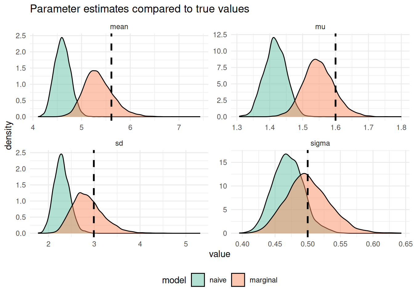
Figure 6.1: The density of posterior draws from the marginal and naive models compared to the true underlying delay distribution (vertical dashed black line).
As expected we see that the naive model has done a very poor job of recovering the true parameters and the marginal model has done a much better job. However, it is important to note that the marginal model doesn’t perfectly recover the true parameters either due to information loss in the censoring and truncation and due to the inherent uncertainty in the posterior distribution.
7 Visualise posterior predictions of the true delay distribution
As a final step we can visualise the posterior predictions of the delay distribution. This tells us how good a fit the estimated delay distribution is to the true delay distribution.
Click to expand for code to create fitted distribution plot
set.seed(123)

predicted_pmfs <- predicted_parameters |>
  group_by(model) |>
  slice_sample(n = 100) |>
  bind_rows(mutate(secondary_dist, model = "true")) |>
  group_by(model) |>
  mutate(
    draw_id = row_number(),
    predictions = purrr::map2(
      mu, sigma,
      ~ tibble(
        x = seq(0, 15, by = 0.1),
        y = dlnorm(x, meanlog = .x, sdlog = .y)
      )
    )
  ) |>
  unnest(predictions) |>
  ungroup() |>
  mutate(model = factor(model, levels = c("naive", "marginal", "true")))

p_fitted_lognormal <- predicted_pmfs |>
  filter(model != "true") |>
  ggplot() +
  geom_line(
    aes(x = x, y = y, col = model, group = draw),
    alpha = 0.05, linewidth = 1
  ) +
  geom_line(
    data = select(filter(predicted_pmfs, model == "true"), -model),
    aes(x = x, y = y),
    linewidth = 1.5,
    col = "black"
  ) +
  labs(
    x = "Delay between primary and secondary event (days)",
    y = "Probability density"
  ) +
  theme_minimal() +
  facet_wrap(~model, scales = "free", nrow = 2) +
  scale_color_brewer(palette = "Set2") +
  theme(legend.position = "none")
p_fitted_lognormal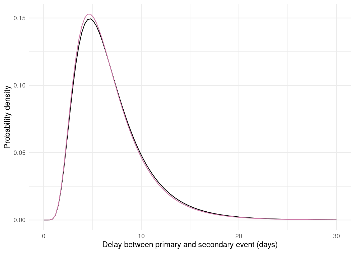
Figure 7.1: The posterior draws from the marginal and naive models (coloured lines, 100 draws from each posterior) compared to the true underlying delay distribution (black line). Each coloured line represents one possible delay distribution based on the estimated model parameters. The naive model shows substantial bias whilst the marginal model better recovers the true distribution.
As expected based on the recovery of the parameters, the marginal model better recovers the true distribution than the naive model which has a substantially shorter mean and different shape.
8 Learning more
The epidist package provides several additional vignettes to help you learn more about the package and its capabilities:
- For more details on the different models available in
epidist, seevignette("model"). - For a real-world example using
epidistwith Ebola data and demonstrations of more complex modelling approaches, seevignette("ebola"). - If you’re interested in approximate inference methods for faster computation with large datasets, see
vignette("approx-inference"). - For answers to common questions and tips for integrating
epidistwith other packages in your workflow, see our FAQ atvignette("faq").